-
了解 CSS Grid Lanes
构建自适应网页布局,完美适配各种形状和大小的内容。探索如何借助 Grid Lanes,通过简洁的 CSS 将不同形状的元素排布为整洁、灵活的网页设计。了解内容流容差如何帮助优化辅助功能体验,同时保持布局的可塑性。
章节
- 0:00 - Introduction
- 1:35 - CSS Flexbox and Grid
- 2:45 - CSS Grid Lanes
- 3:55 - Build a Grid Lanes container
- 4:31 - Implement brick variation
- 4:49 - Experiment with different layouts
- 5:40 - Control individual items
- 7:05 - Flow Tolerance
- 8:46 - Web Inspector
- 9:20 - Next steps
资源
- WebKit.org - CSS Grid Lanes Field Guide
- WebKit.org – Report issues to the WebKit open-source project
- Submit feedback
相关视频
WWDC26
-
搜索此视频…
大家好,我是 Brandon, Safari 团队的一名工程师。 今天,我很高兴向大家介绍 CSS Grid Lanes, 一种全新的网页布局模式。 如果你曾经想要实现这样的设计: 任意大小的项目都能 自然地填入可用空间, 我将向你展示如何构建它—— 只需几行 CSS。
你可能已经通过另一个名字 了解这种排版方式:瀑布流布局。 想象一条瀑布——内容在页面上 自然地以列的形式向下流淌, 每个项目依次落在 上一个项目的下方。 改变方向, 它就变成了砖墙布局, 项目以行的形式横向排列在页面上。 最棒的是: 你不必等待。 Grid Lanes 今天就可以在 Safari 26.4 中使用, 在其他浏览器中也以实验性功能的形式提供。 如果你曾经尝试构建这种布局, 你就知道这并不简单。 你可能会用到 JavaScript 库, 或者用浮动布局或 Flexbox 凑合, 几乎可以用——直到某些情况下不行为止。 CSS Grid Lanes 正是为此而生的。 要理解 Grid Lanes, 先退一步, 思考一下 布局模式究竟做了什么。 每种布局模式 都回答同样的两个问题: 项目放在哪里, 以及它们各占多少空间? Flexbox 和 Grid 各自以 不同的方式回答这些问题。 Grid Lanes 是一种新的模式, 介于两者之间。 我来解释一下:
Flexbox 只给你一个轴, 以及在该轴上流动的 单一通道。 当项目换行时,它们继续 沿同一方向流动。 你可以选择方向: 行或列, 项目依次排列。 切换到列, 同样的规则适用—— 项目从上到下流动, 并换行到下一列。
Grid 采用了不同的方式。 Flexbox 只给你一个轴, 而 Grid 给你两个:列和行。 Grid 将项目放置在 这些轨道交叉处的单元格中。 但当项目具有 不同的宽高比时, 较矮的项目无法填满单元格, 就会出现大片空白区域。 现在,如果这些框是图片, 我们实际上只有三种选择, 而且都不理想。 我们可以拉伸每张图片 以填满单元格, 但这会使它们变形。 或者可以放大并填满空间, 但图片就会溢出 其容器的边界。
也可以裁剪图片, 但你可能会丢失 重要的信息。 Grid Lanes 就是解决方案。 它介于 Grid 和 Flex 之间。 它不像 Grid 那样 在两个维度上进行结构化, 而只在一个维度上结构化, 另一个维度保持自由。 但与 Flex 不同的是, Flex 内容在单一通道中流动并换行, 而 Grid Lanes 将内容 分布到多个通道中。
结果是一种排列紧凑、 错落有致的布局, 同时保持每个项目 的自然比例。 项目逐一放置,每个项目 落入最靠近顶部的 那一列。 这就是为什么较早的项目位置更高, 较晚的项目则填充到下方。 到目前为止,所有示例都是图片。 但 Grid Lanes 并不挑剔, 它适用于任何类型的内容。 试试添加一些文字。 每个文字块会自动换行以适应列宽, 浏览器会为你计算高度。 如果某些内容 需要突出显示,比如标题, 可以让它跨越多列。
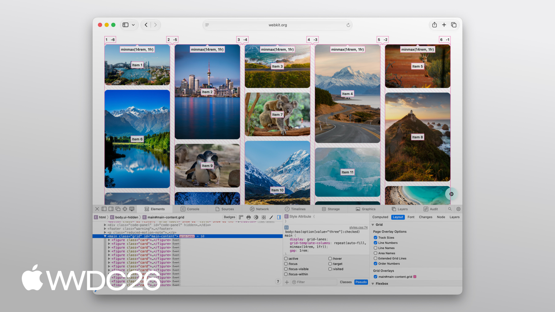
无论你如何改变—— 不同的形状、不同的尺寸, 还是完全不同的设计, Grid Lanes 都能应对。 你已经看到了 Grid Lanes 的能力。 现在,让我们来构建一个。 从一种新的显示类型开始—— grid-lanes。 然后定义列。 grid-template-columns 设置轨道数量 以及每个轨道的宽度。 你会注意到这里使用了 fr 单位。 fr 代表"分数单位"。 它告诉浏览器获取 容器中的可用空间 并将其划分为若干份。 所以,这段代码 表示将空间 分成三等份, 创建三个等宽的列。 并添加 10px 的间距, 就像在 Grid 中一样。
想把它换成 砖墙布局吗? 只需将列换成行。
将 grid-template-columns 属性 替换为 grid-template-rows, 布局就会变成砖墙样式。 唯一的限制: 你只能选择一个方向,不能两个都选。 这就是用三行 CSS 实现的 Grid Lanes。 但这三行代码 给你的控制力远超你的预期。 让我来展示一下。 我从三个等宽列开始。 但列不必是等宽的。 在这里,中间列 占据左右两列各两倍的空间。 现在,不必自己指定 列的数量, 让浏览器来决定。 auto-fill 会创建 尽可能多的列。 minmax() 表示每列 至少 200 像素宽, 但可以增长以填充空间。 同样的思路, 但现在用重复的 窄列和宽列交替排列。 说实话,我最喜欢的 是你能用 几行 CSS 实现这么多效果。 一旦你开始探索, 我相信你也会感到惊叹。
这就是布局部分。 但 Grid Lanes 还允许你 控制单个项目的形态。 让我们重新从 一个简单的 grid-lanes 容器开始, 包含 3 个等宽列。 我想给橙色项目 更多的空间。 在 Grid Lanes 中,我可以使用 Grid 中已有的属性来实现。 使用 grid-column: span 2; 该项目会横跨两列, 其余布局 会自动调整以适应。 或者,将其精确放置在你想要的位置。 在这里,我将该项目设置为 从第 2 列开始,横跨第 2 列和第 3 列。 注意,你可以控制 列的位置,但不能控制行。 Grid Lanes 会为你 决定行的位置。 我将其中一个项目变成了 一张跨越两列的食谱卡片。 卡片内部有一张图片和一些文字, 它们都不参与 Grid Lanes 的布局。
为卡片添加 display: grid-lanes 和 grid-template-columns: subgrid, 其内容就会作为独立项目 加入父级布局。 图片占一列, 文字占另一列, 各自根据内容调整尺寸。 你可以随意嵌套它们。 在 Grid Lanes 容器内使用 普通的 Grid, 或者反过来也可以。 你已经熟悉的工具和语法 都可以沿用, 所以 Grid Lanes 能自然地融入其中。 Grid Lanes 将每个项目 放置在最短的列中。 大多数情况下,效果很好。 但有时候…… 感觉不太对。 这就是 flow tolerance 发挥作用的地方。 浏览器通常会为下一个项目 选择最短的列。 flow tolerance 是一个调节旋钮, 用于放宽或收紧这条规则。 我来详细解释一下。 看这个布局, 同一行中的两个项目 高度几乎相同,但不完全一样。 第二个项目 比第一个项目矮几像素。 这意味着第二个项目下方的区域 距容器顶部更近, 所以浏览器会将下一个项目 放在第二列, 第四个项目填充到第一列。
这使得我们的项目布局 在第一行从左到右排列, 在最后一行从右到左排列。 Tab 键顺序与内容 视觉呈现顺序之间的差异 会影响用户的无障碍访问, 并可能带来混乱的体验。 现在打开 flow-tolerance。 我们回到了两列各有两个项目的状态, 但 flow-tolerance 改变了规则。 对于每个新项目, 浏览器会问同样的问题: 较高的列是否小于 较短的列加上 flow-tolerance? 对于第三个项目,是的—— 差距在容差范围内, 所以它填入第 1 列。 但现在第 1 列变得更高了。 对于第四个项目,差距太大无法忽视, 所以它落入 较短的列:第 2 列。 默认情况下,Grid Lanes 使用 1em 的 flow-tolerance。
尝试不同的 flow-tolerance 值, 找到最适合你内容的设置。
flow-tolerance 在适合你内容时非常好用, 但给予浏览器更多灵活性的另一面 是有时 结果可能会出乎意料。 当这种情况发生时, 打开 Web Inspector 来了解发生了什么。 好消息是,Web Inspector 完全支持 Grid Lanes。 你可以看到 显示列和行的线条。 每个项目上都会显示顺序编号, 这样你就能清楚地看到 项目是如何排列的。
它甚至还会绘制出 项目之间的间距。 所有这些,只需 开启覆盖层即可。
CSS Grid Lanes 让你用 以前需要 JavaScript 才能实现的布局, 只用几行 CSS 就能完成。 它建立在你已经熟悉的 Grid 知识之上, 并能适应你的内容, 而不是反过来。 它是网页平台的一个出色新特性, 我迫不及待想看到 你用它构建出什么。 查看 WebKit 团队为你制作的 Grid Lanes Field Guide, 里面有详细的演示说明 和交互式示例, 你可以在其中试验 今天介绍的每个属性。 在你自己的项目中试用 grid-lanes。 它自 Safari 26.4 起就已可用, 我们认为它确实可以改变 你处理图片密集型布局的方式。 请分享你的反馈。 我们很乐意听到 grid-lanes 对你的使用情况如何, 以及你希望接下来看到什么。 要了解 Safari 即将推出的 所有其他功能,请务必查看 《Safari 27 WebKit 新特性》。 感谢观看, 祝你在 WWDC 期间愉快!
-
-
3:58 - Create a Grid Lanes Container
.container { display: grid-lanes; } -
4:02 - Create a Grid Lanes Container
.container { display: grid-lanes; grid-template-columns: repeat(3, 1fr); } -
4:26 - Create a Grid Lanes Container
.container { display: grid-lanes; grid-template-columns: repeat(3, 1fr); gap: 10px; } -
4:33 - Implement a Brick Variation
.container { display: grid-lanes; grid-template-columns: repeat(3, 1fr); gap: 10px; } -
4:36 - Implement a Brick Variation
.container { display: grid-lanes; grid-template-rows: repeat(3, 1fr); gap: 10px; } -
4:58 - Experiment with different layouts
.container { display: grid-lanes; grid-template-columns: 1fr 1fr 1fr; gap: 10px; } -
5:02 - Experiment with different layouts
.container { display: grid-lanes; grid-template-columns: 1fr 2fr 1fr; gap: 10px; } -
5:10 - Experiment with different layouts
.container { display: grid-lanes; grid-template-columns: repeat(auto-fill, minmax(200px, 1fr)); gap: 10px; } -
5:24 - Experiment with different layouts
.container { display: grid-lanes; grid-template-columns: repeat(auto-fill, minmax(8rem, 1fr) minmax(14rem, 2fr); gap: 10px; } -
5:45 - Control Individual Items
.container { display: grid-lanes; grid-template-columns: 1fr 1fr 1fr; gap: 10px; } -
5:59 - Control Individual Items
.container { display: grid-lanes; grid-template-columns: 1fr 1fr 1fr; gap: 10px; } .item { grid-column: span 2; } -
6:07 - Control Individual Items
.container { display: grid-lanes; grid-template-columns: 1fr 1fr 1fr; gap: 10px; } .item { grid-column: 2 / span 2; } -
6:22 - Integrate Subgrid
.container { display: grid-lanes; grid-template-columns: 1fr 1fr 1fr; gap: 10px; } .item { grid-column: span 2; } -
6:34 - Integrate Subgrid
.container { display: grid-lanes; grid-template-columns: 1fr 1fr 1fr; gap: 10px; } .item { display: grid-lanes; grid-template-columns: subgrid; grid-column: span 2; } -
6:48 - Integrate Subgrid
.container { display: grid-lanes; grid-template-columns: 1fr 1fr 1fr; gap: 10px; } .item { display: grid; grid-template-columns: subgrid; grid-column: span 2; } -
8:37 - Improve item positioning
.container { display: grid-lanes; grid-template-columns: 1fr 1fr; gap: 10px; flow-tolerance: normal; } -
8:41 - Improve item positioning
.container {
	display: grid-lanes;
  grid-template-columns: 1fr 1fr;
  gap: 10px;
  flow-tolerance: 2.1em;
}
-
-
- 0:00 - Introduction
Learn about CSS Grid Lanes, a new layout mode for masonry-style "waterfall" and "brick wall" design patterns in just a few lines of CSS, available now in Safari 26.4.
- 1:35 - CSS Flexbox and Grid
Understand what a layout mode actually does and see why Flexbox and Grid fall short for content with mixed aspect ratios, where stretching, zooming, and cropping all distort your design.
- 2:45 - CSS Grid Lanes
Learn how Grid Lanes fits between Grid and Flexbox, structuring one axis while leaving the other free so items pack tightly without distortion. Each item lands in whichever column leaves it closest to the top, and the same rules apply to images, text, or any other content.
- 3:55 - Build a Grid Lanes container
Build your first Grid Lanes layout in three lines of CSS: `display: grid-lanes`, `grid-template-columns` with `fr` units to divide available space into fractions, and `gap` to space items apart.
- 4:31 - Implement brick variation
Flip the layout 90 degrees by swapping `grid-template-columns` for `grid-template-rows` to flow items horizontally into a brick-wall layout. Grid Lanes structures one direction at a time — pick columns or rows, not both.
- 4:49 - Experiment with different layouts
Use the full power of CSS track sizing inside Grid Lanes: unequal column widths, `auto-fill` with `minmax()` to let the browser choose how many columns fit, and repeating patterns of narrow and wide columns.
- 5:40 - Control individual items
Shape individual items using familiar Grid properties — `grid-column: span 2` to stretch an item across columns, explicit column placement (rows are still chosen for you), and `grid-template-columns: subgrid` to align nested content with the parent layout.
- 7:05 - Flow Tolerance
Discover why the shortest-column rule can produce visually pleasing layouts that confuse keyboard users when DOM order and visual order diverge. The `flow-tolerance` property loosens the rule so items prefer to fill earlier columns when heights are similar, with a default of `1em` you can tune to your content.
- 8:46 - Web Inspector
Debug Grid Lanes layouts visually with Safari Web Inspector. Turn on the overlay to see column and row lines, gaps, and order numbers projected over each item — useful when tuning `flow-tolerance` or diagnosing surprising placements.
- 9:20 - Next steps
Explore the WebKit team's Grid Lanes Field Guide for interactive demos, try Grid Lanes in your own projects (available in Safari 26.4), and share feedback with the team. To see what else is coming to Safari, watch "What's new in WebKit for Safari 27."